Real Home Prices Seem Important
With the US government bond yield curve fully inverted, and a trade war with China escalating in fits and starts, it seems like a good time to explore some other recession indicators. In particular, this chart in a Dash of Insight article about two months ago really caught my eye (originally from Calculated Risk): 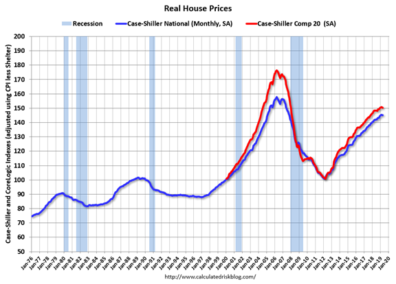 I have heard that housing is a pretty important part of the business cycle, but I had never seen a chart before that made the relationship so obvious. Apparently, the only recession since 1976 not associated with a drop in real home prices was the dot-com bust in 2001, which was pretty minor in terms of actual GDP impact (if not in terms of stock prices). All the other recessions in this period include declining real home prices, and what's more, in each case the drop in home prices appears to begin before (or in the 1980 case, coincident with) the official start of the recession. I wanted to see if the same relationship holds in earlier periods, and get an update on how the series is looking more recently. First, a sanity check that I can reproduce the chart above, using home prices data from the Case-Schiller index and recessions data from our good friend FRED.
 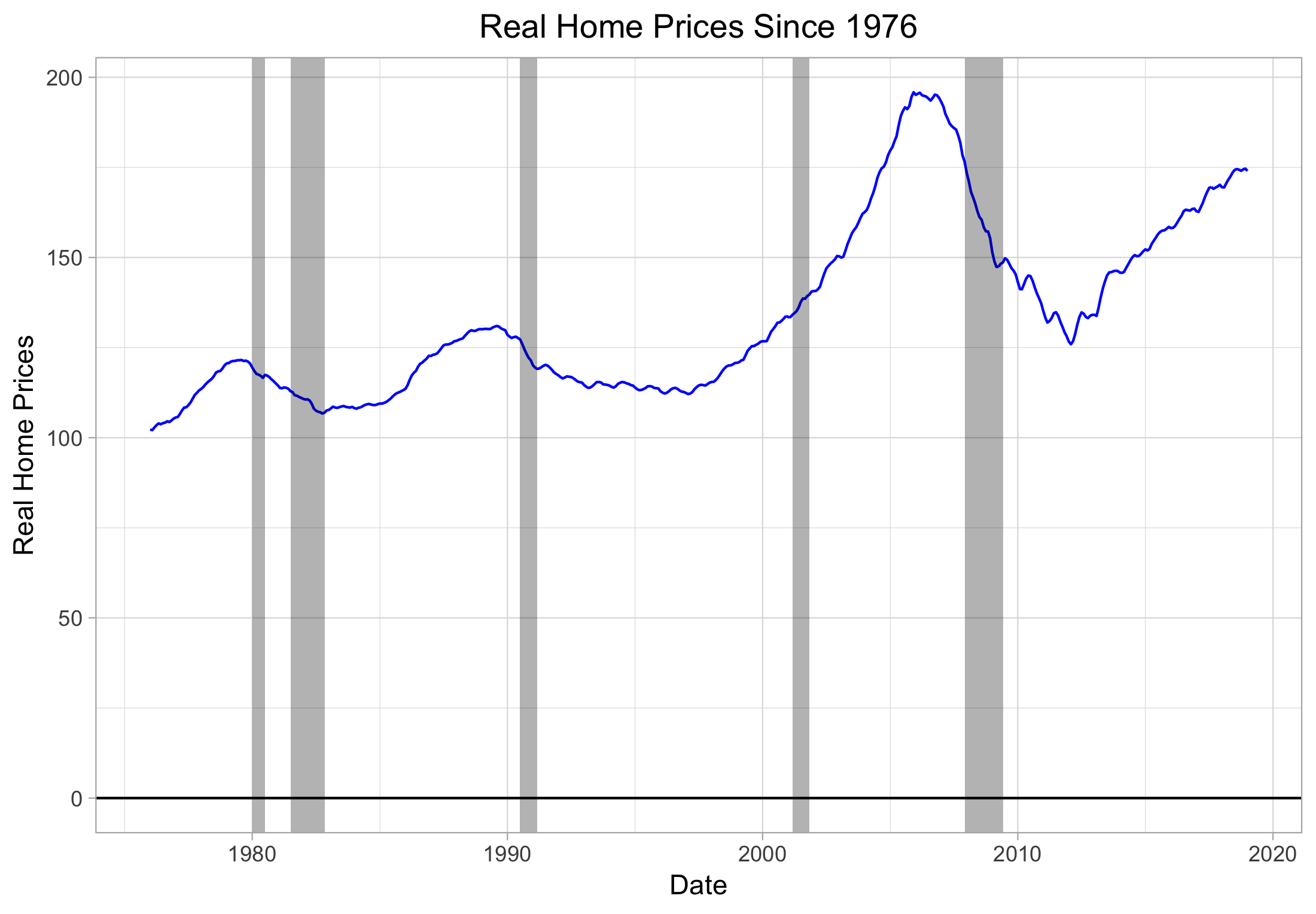 Good enough. How about a quick test of an actual recession indicator. Just eyeballing the chart, I chose a decline of 3% in real home prices from the previous peak (resetting only after an increase of 3%).
 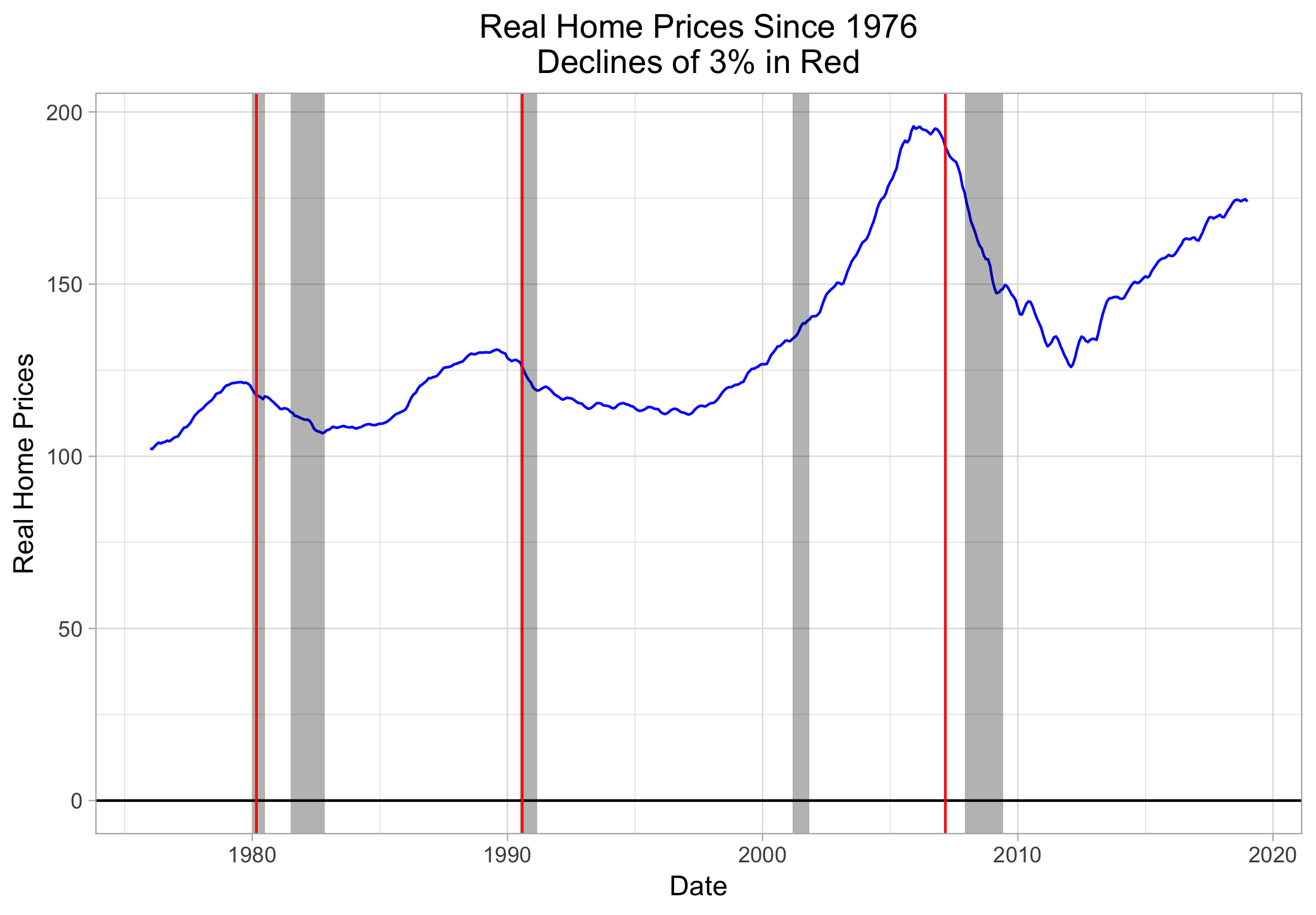 Not bad! This particular choice of recession indicator triggers in the middle of the 1980 recession, coincident with the start of the 1990-1 bust, and well ahead of the 2008 financial crisis aka "Great Recession" (aside - how did nobody ever come up with a better name for that? It feels the economic journalism equivalent of "Pirates of the Caribbean 16". I guess we're just generally out of ideas), and importantly, there are no false positives. The real test of course is how it performs in out-of-sample data. The Case-Schiller series is only available on a monthly basis since 1953, so let's first look at the period 1953 - 1976:
 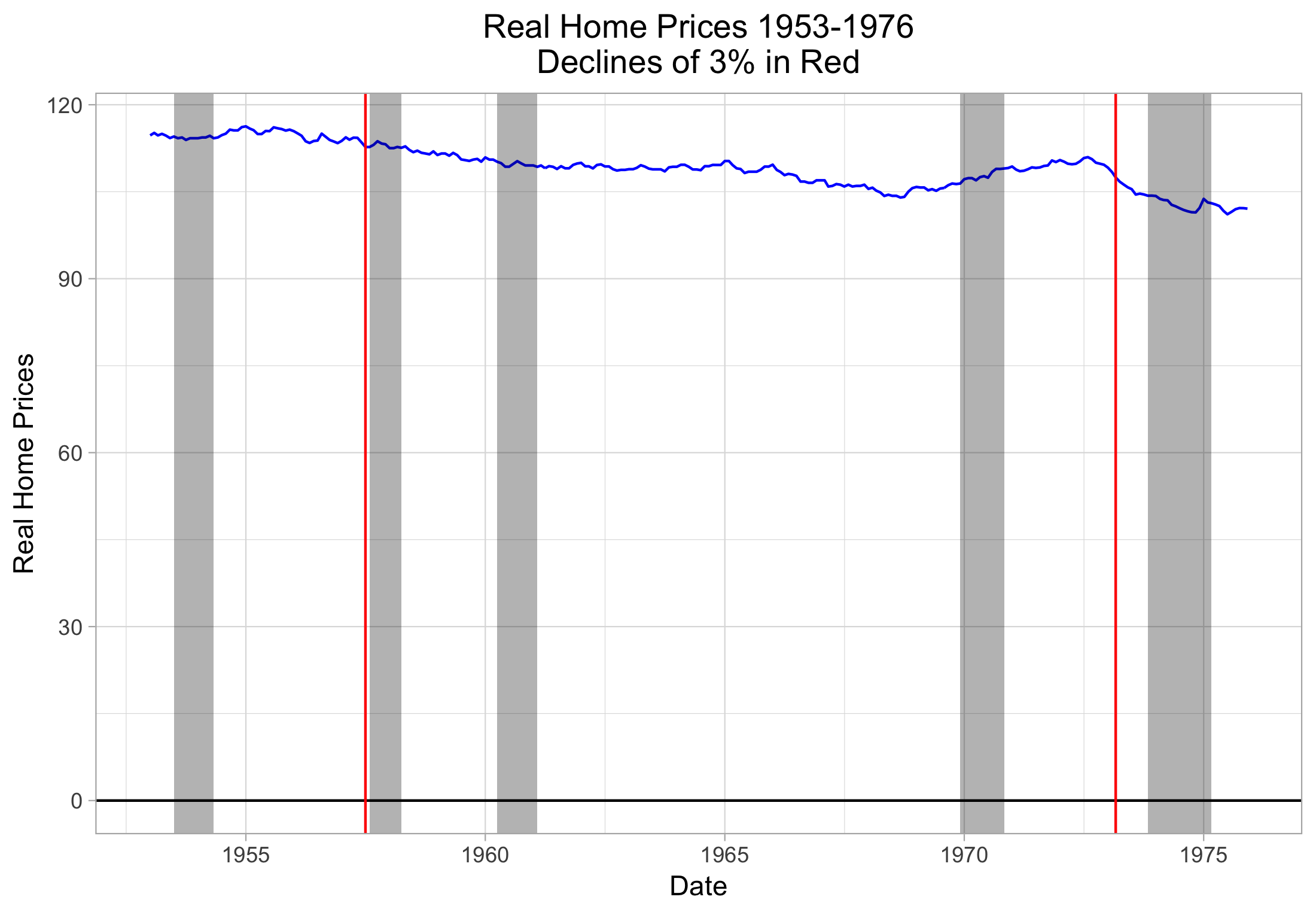 Again, not bad. A drop of 3% in real home prices precedes two of the recessions in this period, again with no false positives. Oddly, real home prices were in a slow but steady decline during much of this period. In all honesty it seems mostly due to luck that the indicator calls the 1957 recession, as the decline continues for another 10 years. You could have predicted a recession anytime between about 1956 and 1968 using some version of this indicator, we just happened to nail the 1957 based on the choice of cutoff (choosing a 3% decline instead of 2 or 4 or whatever). This series is actually available all the way back to 1890, but only on an annual basis before 1953. Still, let's see how the same indicator would do in the earlier period:
 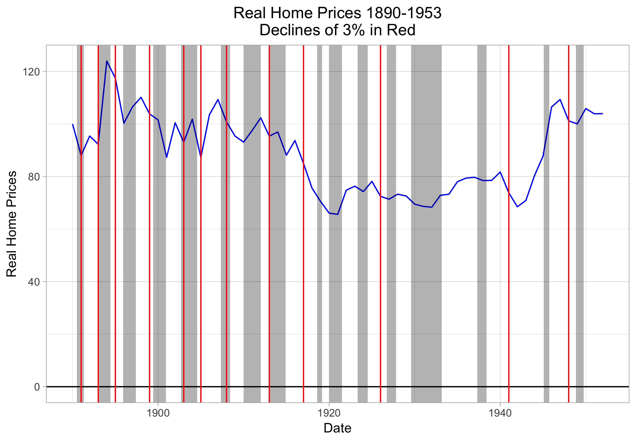 So...not great, but this doesn't bother me too much. There are a lot of reasons the relationship wouldn't hold in this period; I'm sure the quality of home price data available for 1908 is not quite up to par with more recent stuff, we had big world war-shaped wrenches thrown into the mix, and having data on an annual basis only rather than monthly doesn't help. But mostly, the US economy just looked a whole lot different during the first half of the twentieth century than the second; home ownership was still under 44% in 1940 (according to US Census data), but rose quickly after WWII and has remained above 60% since. For some completely anecdotal evidence of how different the attitudes towards home ownership were even as recently as 1946, check out this movie where the mortgage lenders are the good guys. Ain't gonna happen today. Anyway, it looks like the Case-Schiller real home prices data is a pretty good leading (or at least coincident) indicator for recessions. What does the data tell us about the current state of affairs? It looks like all is well, at least for now: real home prices are still rising at a 3.1% YoY clip as of June 2019, and still outpacing inflation of 1.6% in the same month. One note of caution is that the pace of increase dropped from 3.3% in the prior month, but that's a yellow flag at worst. However, in digging around for various flavors of home price data, I noticed something strange. A different, but closely related series, is showing a drop in real home prices recently. That would be the FRED's Median Sales Price of Houses Sold (the original source is the US Census Bureau), which is showing a drop not only in real terms but nominally as well (the recent peak was all the way back in Q4 of 2017):
 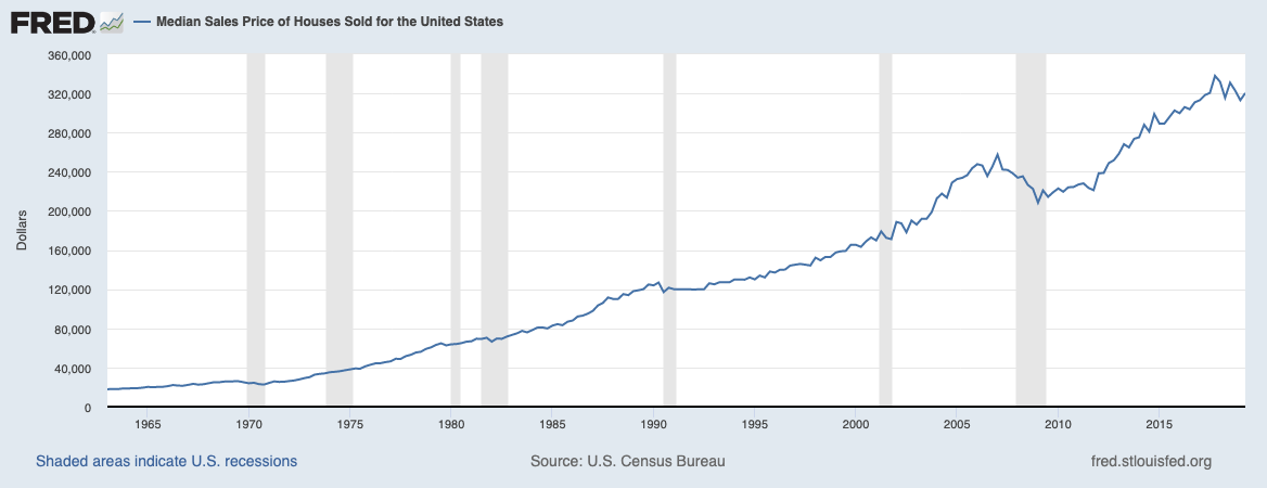 I checked whether the same indicator threshold (a 3% drop from the prior peak) worked for this series, after deflating it with the CPI, also from FRED:
 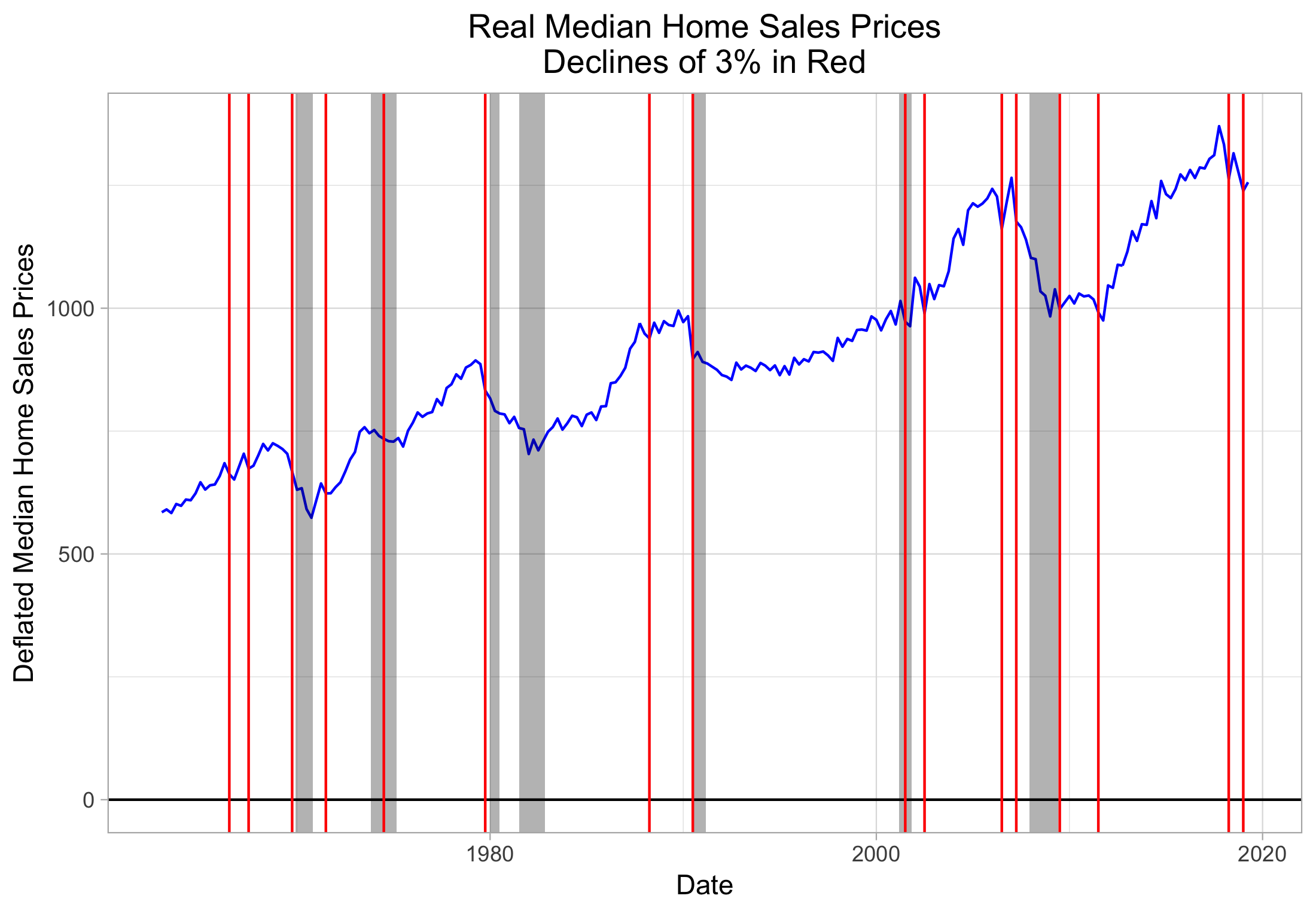 Yeah that's no good. This series is way too noisy, and we are also probably missing some seasonal factors, as an outsized number of the big drops appear occur in July. Here's the same methodology but using the 4-quarter moving average instead, to smooth the data and try to sidestep any seasonality issues:
 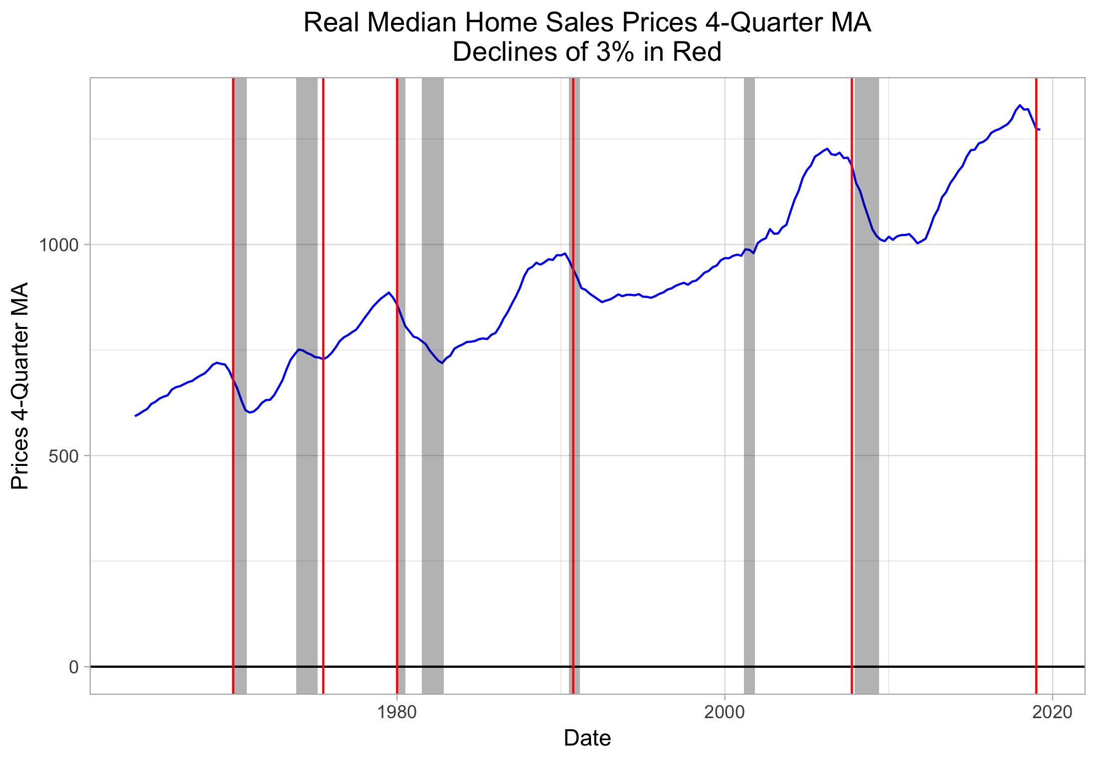 Much better. This triggers at pretty much the same points as the Case-Schiller: the only differences are one additional trigger right at the start of the 1969-70 recession, and the median sales data is a bit late on the 1973-5 recession. And of course, worryingly, the most recent trigger, which occurs in Q1 of this year. What should we make of this? One series is telling us everything is fine, the other, which has produced at most one false positive, if you count the late call on the 1973-5 recession as such, is predicting a recession. Here's a view of both on the same chart:
 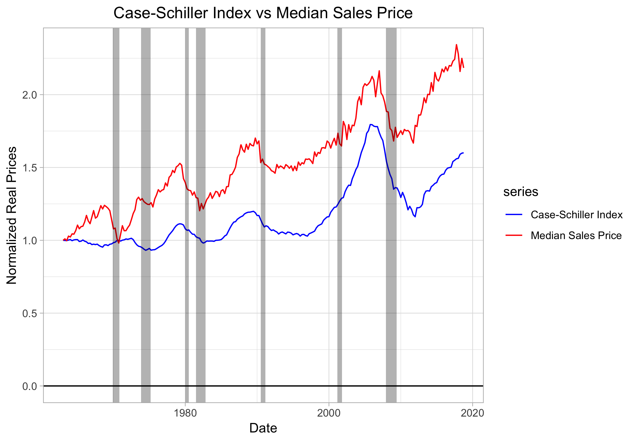 Only once before have these 2 series meaningfully diverged: in the late 1960's, when the Case-Schiller index gradually climbed, while the real median sales price dropped precipitously. Unfortunately, in that case, it was the latter that made the correct call, with a recession beginning in December 1969. Of course, there's no guarantee things will play out the same way this time, but if you are looking for reasons to worry, well, here's one more. P.S. It is a bit puzzling that the real median sales price climbs much quicker than the Case-Schiller real home prices index, since both are deflated by the CPI. It's possible that the Case-Schiller data uses a different version of CPI than I have used here, or it could simply be that the prices of sold homes have tended to grow more than the prices of not-sold homes over the last 40ish years. Either way, since we're only interested in trends, as long as the series agree directionally, things should be OK.