Don't Fear the Yield Curve
The Yield Curve! It's the latest in a growing list of things to worry about if you are long US equities. In particular, you may have read that when the yield curve is "inverted", meaning short-term rates are higher than long-term rates, it's a good indicator of an upcoming recession. The research here is pretty conclusive: according to the San Francisco Fed, a yield curve inversion has preceded every recession in the last 60 years. Here's the data since 1976 (recessions shaded): 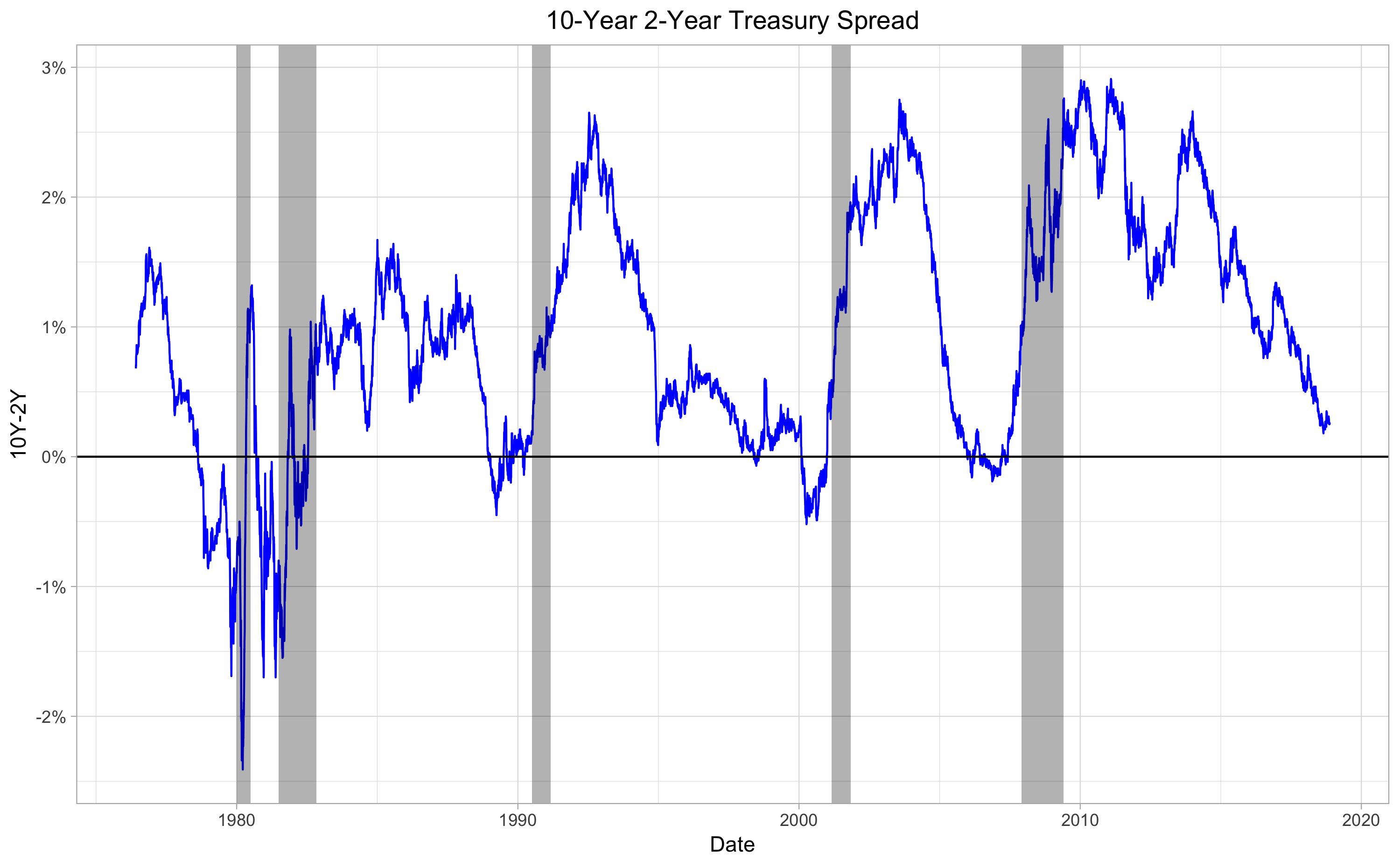 However, predicting recessions with some advance notice doesn't necessarily make an indicator valuable for investing; since stock market declines typically start a few months before a recession officially begins, even a good recession predictor may be too late (or too early) if you are planning to use it to time investments. Ben Carlson looked earlier this year at the lag times between yield curve inversions, recessions, and market peaks, and shows that there's quite a bit of variability. Still, maybe there's something useful here. Reliable indicators of future recessions don't come along every day, so let's see if we can squeeze some market-timing goodness out of the yield curve after all. First, the data: I'm using the 10- to 2-year treasury spread to describe the yield curve, describing it as "positive" when the 10-year yield is greater than the 2-year yield, and "inverted" when the 2-year yield is higher. Daily data for this series is from FRED and goes back to 1976 (I may revisit this analysis with data that goes back further if I can find a good source). Daily S&P 500 price data is from Yahoo. First, let's look at daily S&P 500 returns when the yield curve is positive vs when it is negative, or inverted:
 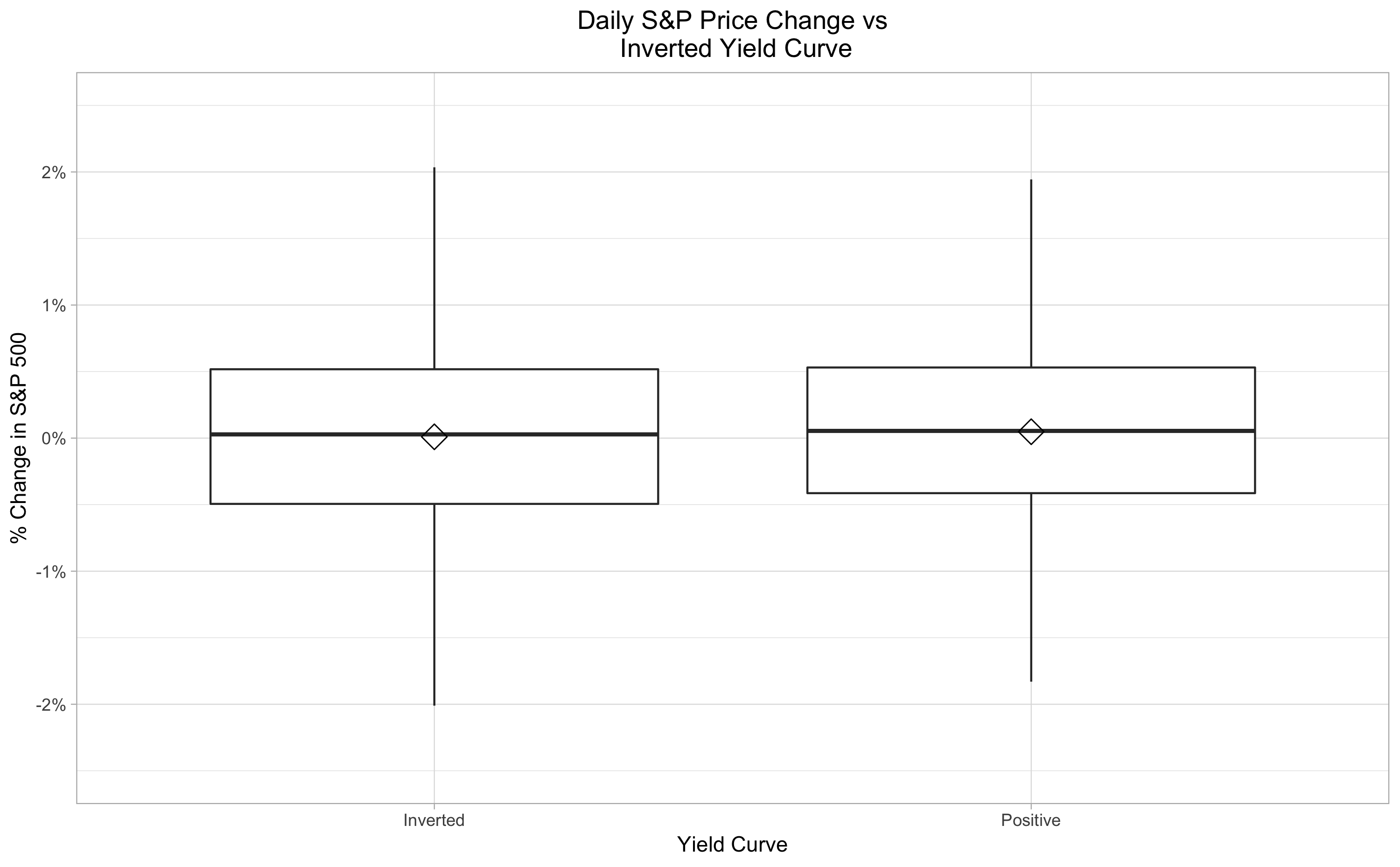 OK, so it appears that a positive yield curve is slightly better for stocks than a negative, but not convincingly. The numbers bear this out: the median and mean S&P 500 price change when the yield curve is positive are 0.053% and 0.041% respectively, versus 0.030% and 0.019% when it is inverted. However, a statistical test to determine whether prices are more likely to fall when the yield curve is inverted (chi-squared test of independence) yields a p-value of 0.2209, not statistically significant or particularly close. With 10,712 data points (1,544 with an inverted yield curve), it's pretty reasonable to expect statistical significance if there were really a strong effect here. So it's not clear that a simple strategy of "sell when the yield curve is inverted, buy when it's positive" will be very effective. But maybe we can still use yield curve inversions as a signal in some other way. Let's take a look at the big picture:
 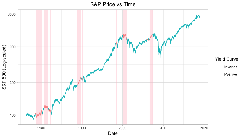 The yield curve inversion seems to have called the last two major market tops almost perfectly: in 2000, the market peaked during a yield curve inversion, and in 2008, it peaked shortly after one. For the prior yield curve inversions, though, the pattern is not nearly as clear. Here's another view of the same data, showing the change in the S&P 500 price after each yield curve inversion (only the series lasting longer than 200 days are labeled):
 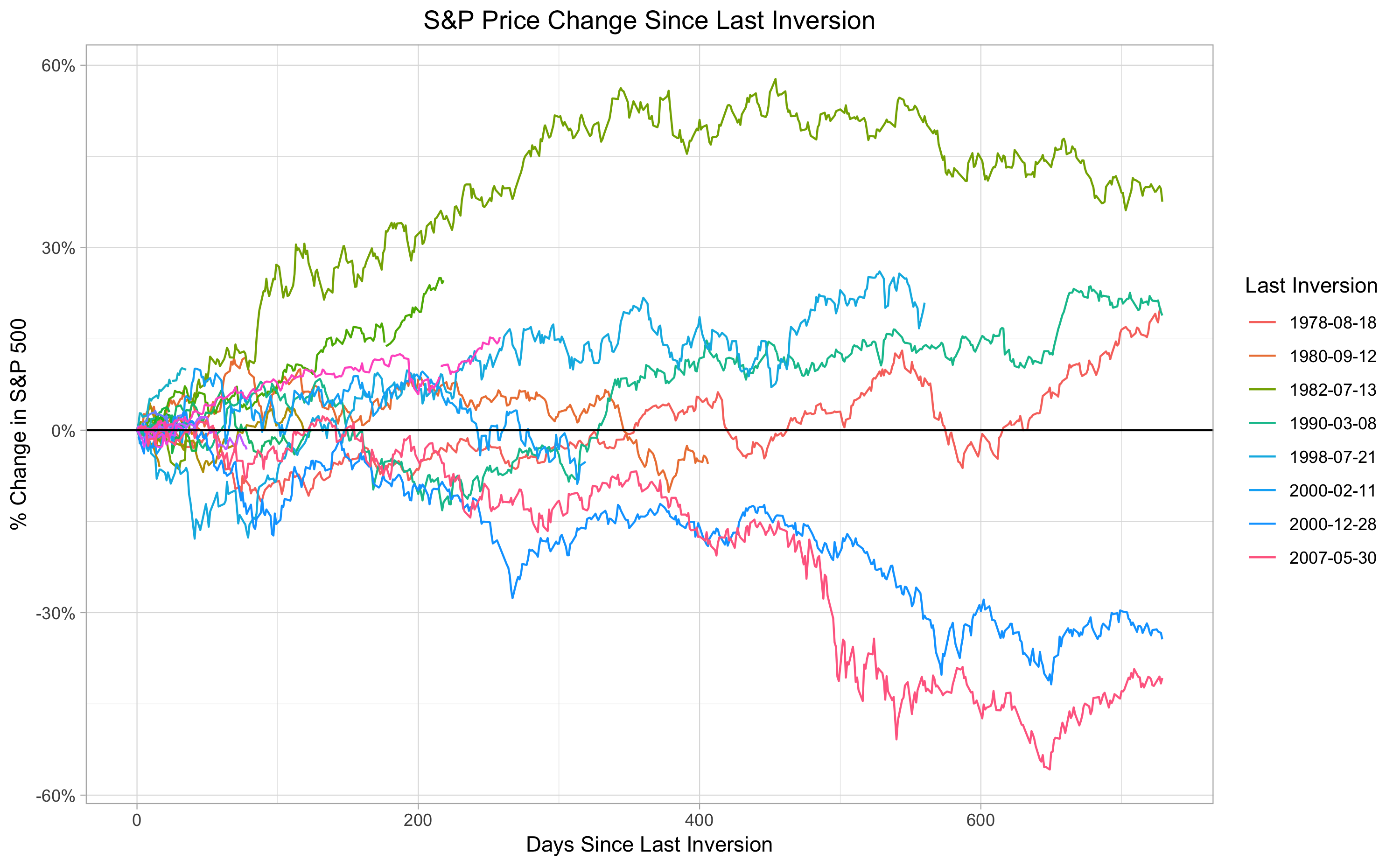 This view shows more clearly that, well, there isn't any clear pattern. For the 2000 and 2007 cases (the long blue and pink lines at bottom) the market drops steadily after the last yield curve inversion, and even bottoms after roughly the same length of time. In another case, the July 1998 yield curve inversion, there is a brief but intense drop followed by a quick recovery. All other cases are some version of meandering sideways or up. Also, notably, the other major market drop during this time period, the September 1987 "Black Monday" crash, was not preceded by a yield curve inversion, and also not accompanied by a recession. To see how a strategy of "sell the S&P when a yield curve inversion occurs, buy back in after N days" would perform on average, we can look at the average S&P price change since the last inversion:
 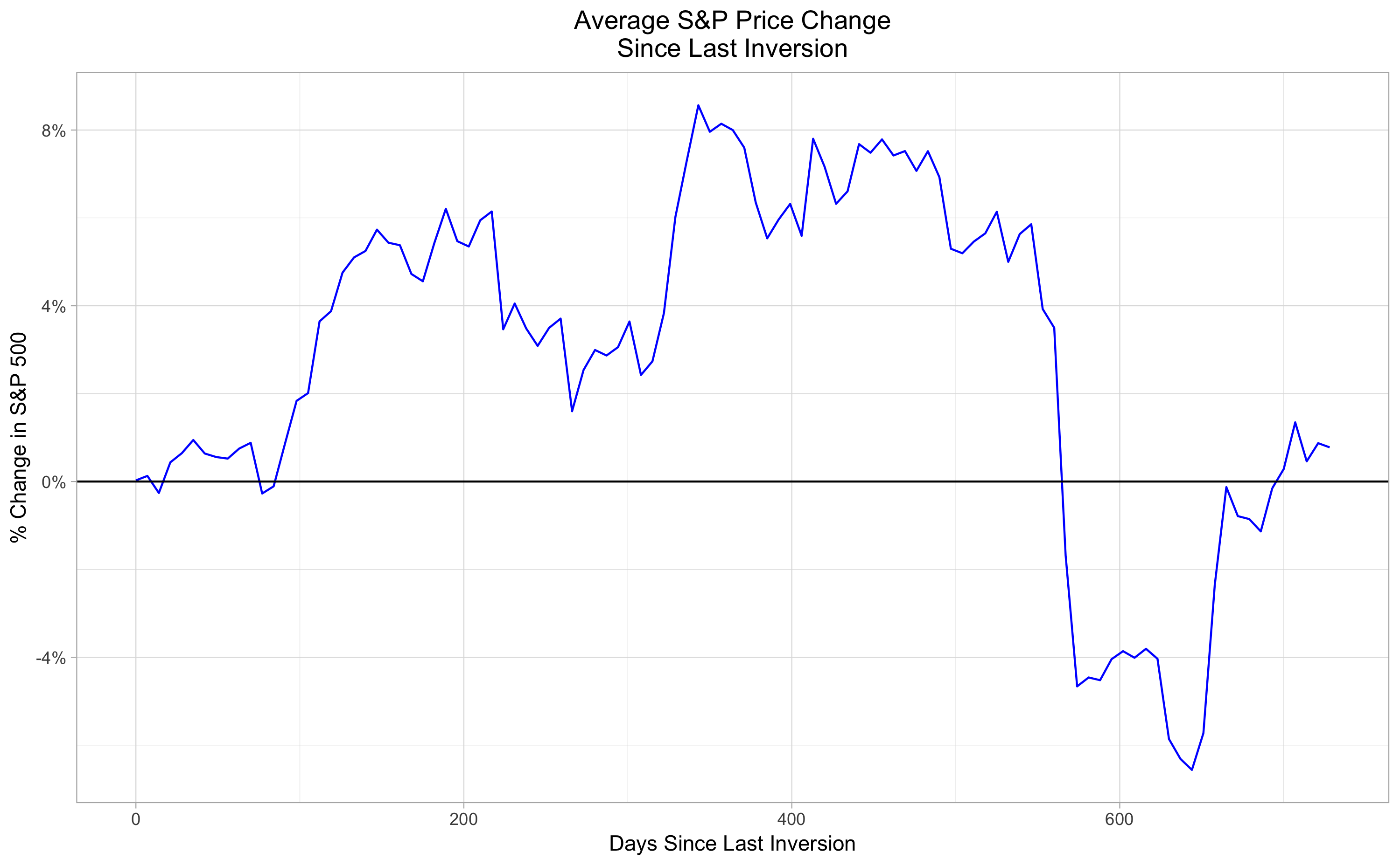 This looks like nothing out of the ordinary in terms of stock price movements. If the average stayed consistently negative for the first 100 days, I might be convinced that a strategy of "sell when the yield curve inverts, get back in after 100 days" was a viable market-timing strategy. Unfortunately, there's nothing so clear. So far, a bit disappointing. This very promising indicator doesn't yield any simple, obvious market-timing strategy. However, I'm not ready to give up completely just yet. In subsequent posts, I plan to dig deeper into the yield curve as a market timing indicator, possibly combining the yield curve with S&P price momentum, looking at bond returns during and after yield curve inversions, and ideally finding some quality data prior to 1976.